Monochromatic Newborn & Baby Photography: Why It Makes Your Baby Stand Out More
Why I Love Monochromatic Setups (and Why They Work So Well)
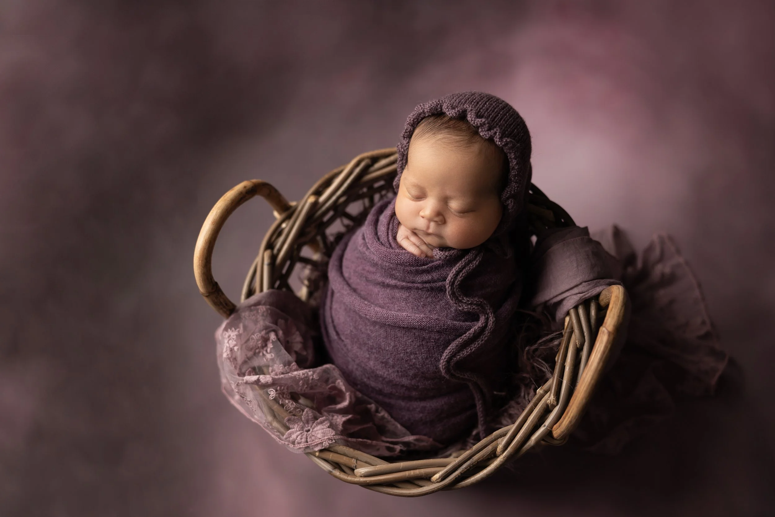
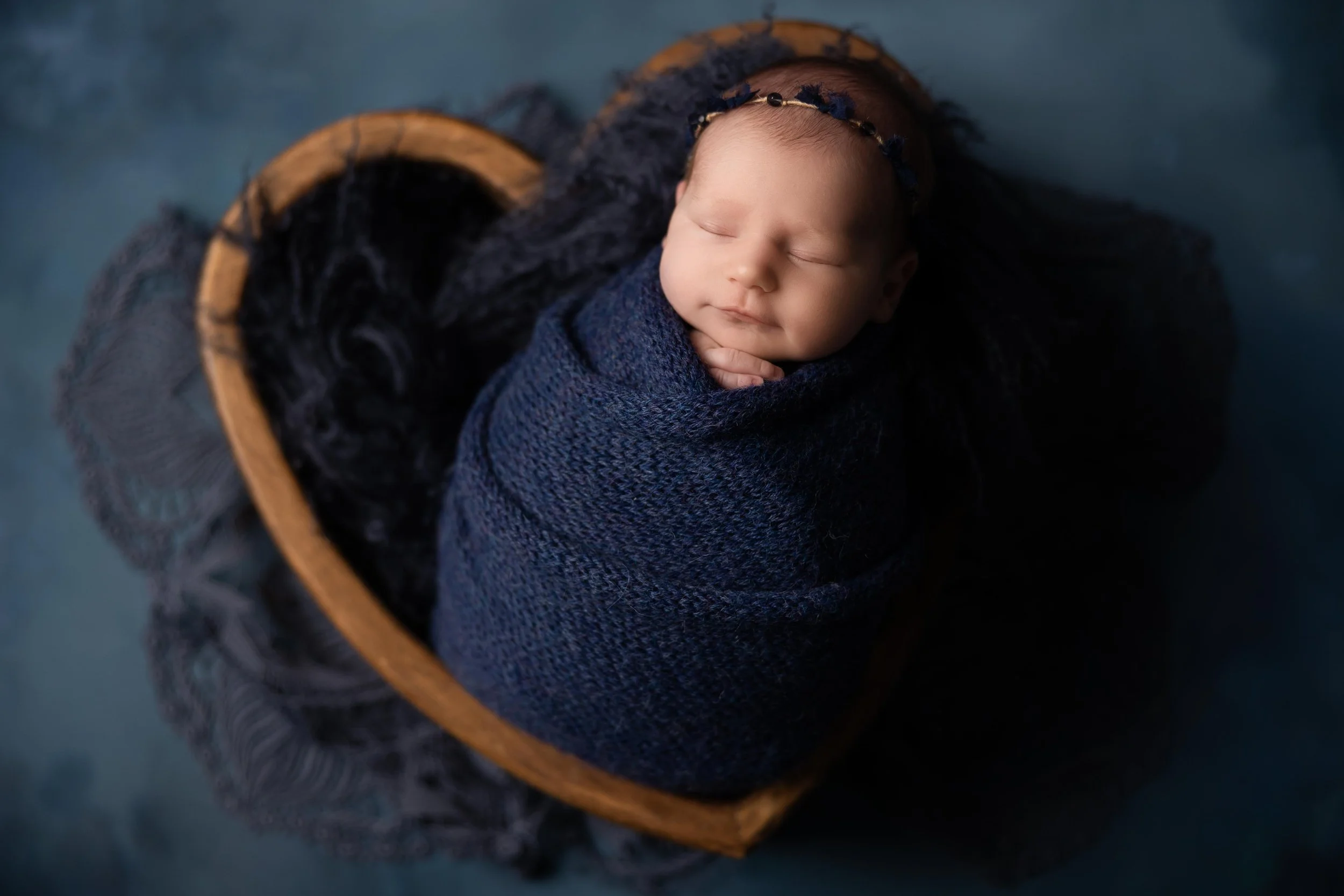
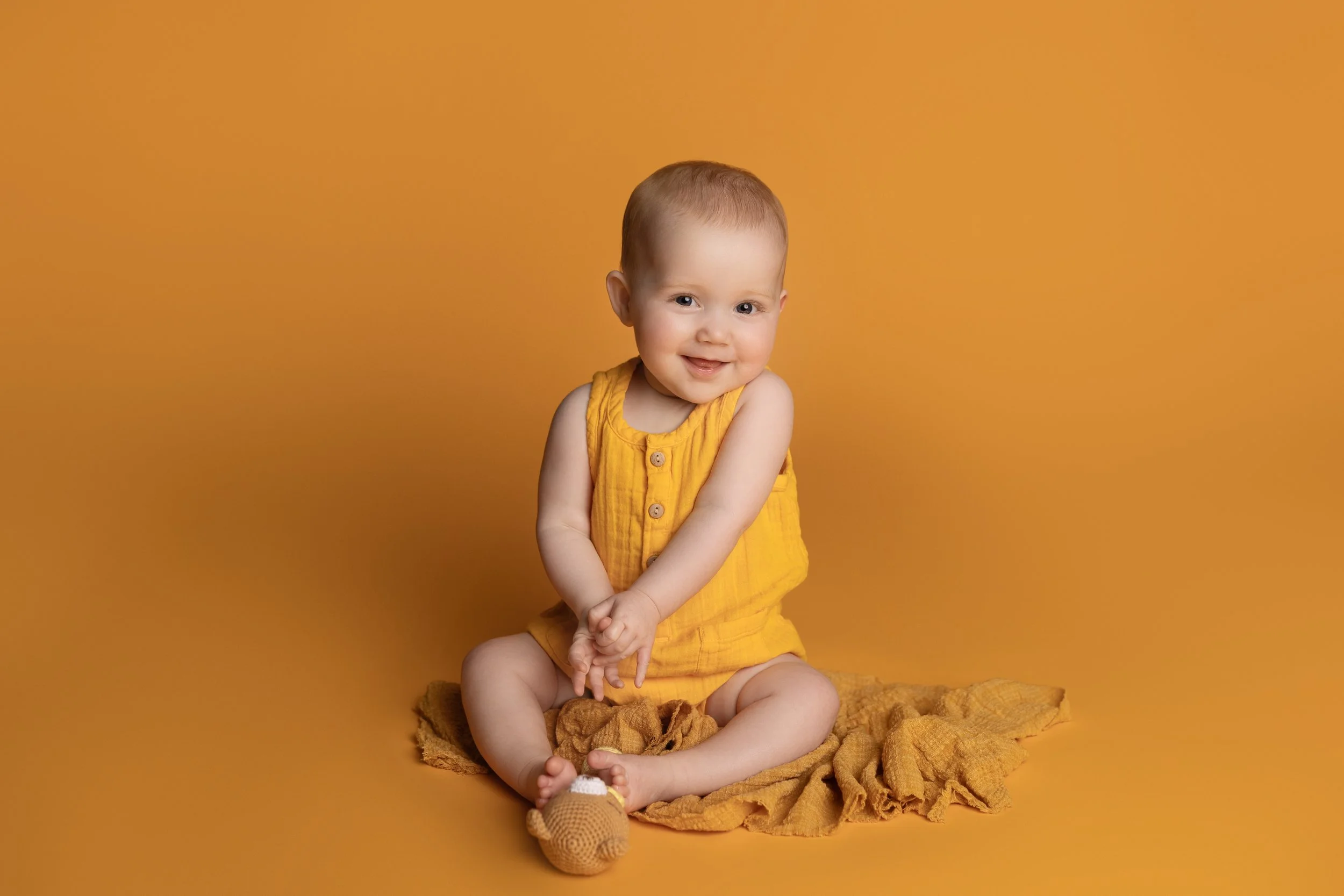
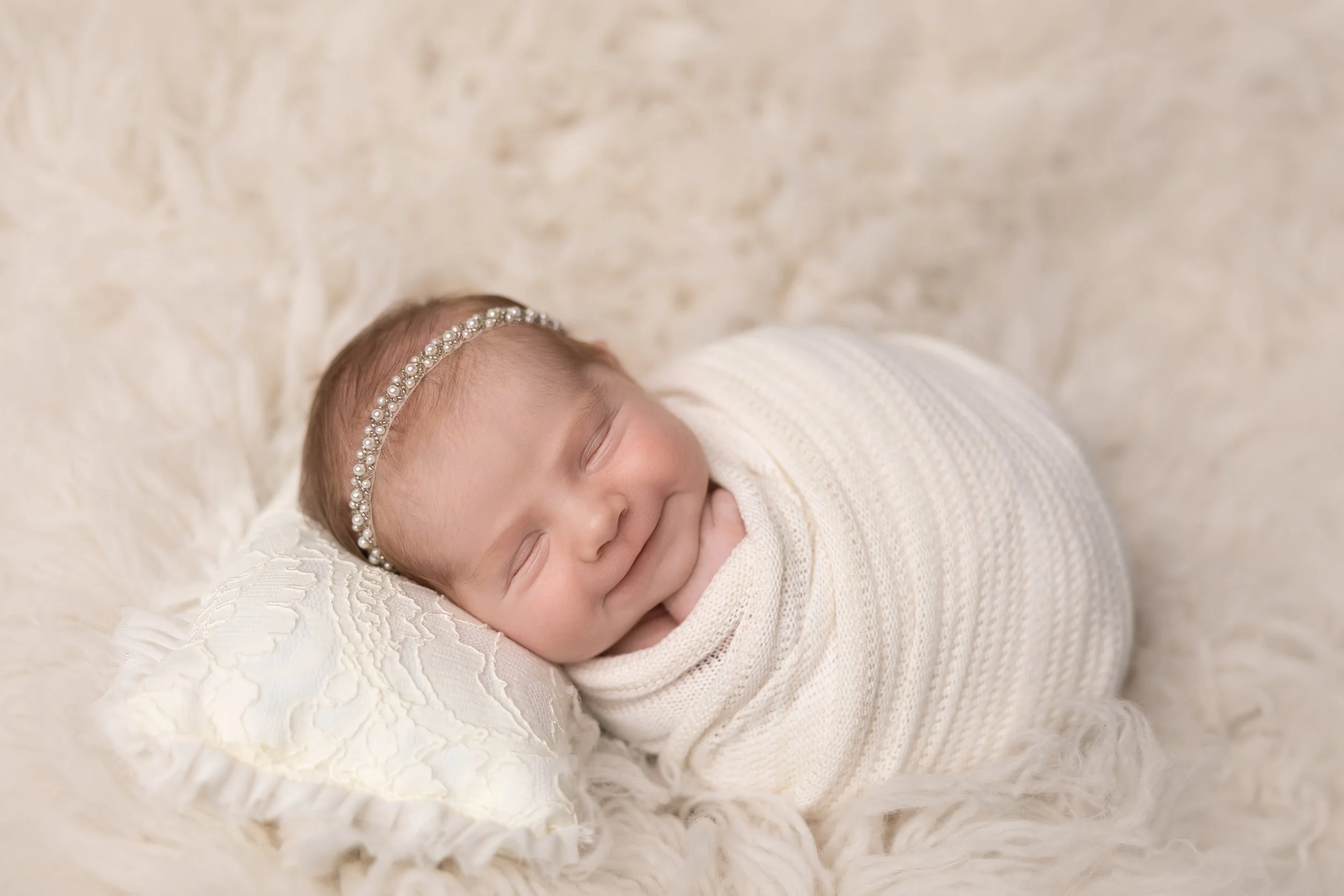
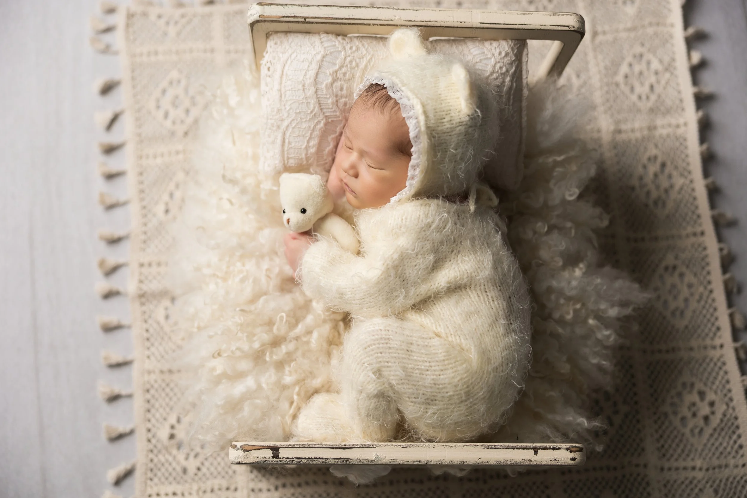
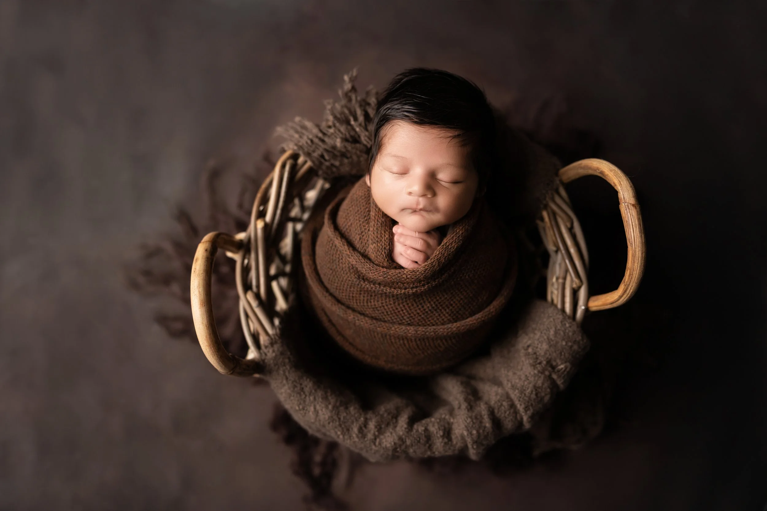
I often hear clients say they want a different color background so there’s more contrast. They’re worried that if the baby’s outfit is the same color as the background, they’ll “get lost.” When actually, the opposite happens. Monochromatic setups are what make the baby pop, because your eye goes straight to them instead of bouncing around the image. And when I say monochromatic, I don’t just mean neutrals. It can be soft pinks, bold purples, warm yellows…anything where the tones stay within the same color family.
What Monochromatic Actually Means (It’s Not Just Beige)
Monochromatic simply means everything in the image stays within the same color palette.
That could look like:
soft blush tones
deep purples
warm golden yellows
creamy neutrals
It doesn’t mean boring. It means cohesive.
Why Contrast Isn’t What Makes a Baby Stand Out
High contrast feels like it should make the subject pop. But what it actually does is split your attention.
Your eye goes:
background → outfit → props → baby
Instead of:
baby → done
Monochromatic setups remove those distractions so your brain locks onto the most important part immediately.
Color Works Too (And Sometimes Even Better)
Monochromatic doesn’t mean you have to play it safe. Bold color works beautifully when everything stays within the same tone.
It Feels More Timeless
Trendy color combos come and go. Monochromatic images don’t. They’re simple, classic, and still feel beautiful years later, which is exactly what you want for something you’re putting on your walls.
Texture Becomes the Star (Without Being Distracting)
When color isn’t competing, texture adds interest instead.
Things like:
soft wraps
delicate fabrics
subtle layers
They create depth without pulling attention away from the baby.
It Actually Makes Gallery Design Better
This is more behind-the-scenes, but it matters. When your images are cohesive in color, your gallery feels more elevated and intentional instead of random. And that translates to a more polished final product.
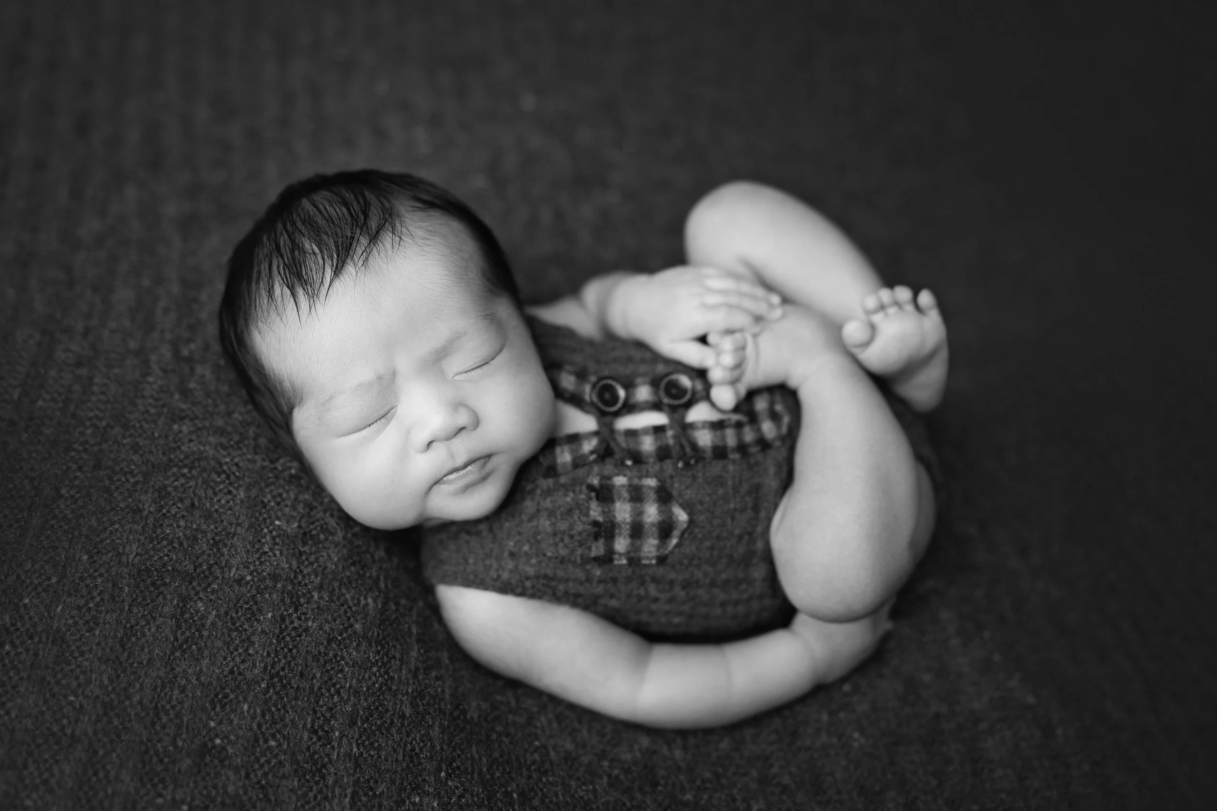
Black and White Images Turn Out Better
Most homes aren’t decorated in bold, clashing colors. They’re neutral, warm, or softly styled.
Monochromatic images fit anywhere:
nurseries
living rooms
gallery walls
They don’t compete with your space, they complement it.
It Feels More Like Your Baby, Not a Setup
When there’s less going on in the image, you notice more of what actually matters: their expression, their tiny features, their personality. Not the backdrop. Not the color contrast. Just them.
Final Thoughts
If you’re worried your baby will “blend in” with a matching setup… they won’t. They’ll stand out more. Because nothing else is competing for your attention.
If you love clean, simple, timeless images like this, you’ll probably love my style. Let’s chat!